Intro to Electricity Demand Analysis & Forecasting

NYC Night Lights
Electricity demand forecasting plays a crucial role in the energy industry as it assists energy providers in effectively planning for supply and demand, thereby preventing any potential shortages or surpluses. Accurate forecasting of electricity demand can lead to better management of resources, improved operational efficiency and ultimately, cost savings. For this Project I wanted to analyse the NYC electricity demand enriched using NOAA weather data for NYC whether I could answer the following questions: What effect does date & time play in influencing daily electricity demand in NYC? What are the Seasonal patterns in the data?
- Do holidays or events play any role?
- How does it vary with day, week, month, etc? How viable are traditional ML algorithms in forecasting Day Ahead Electricity Demand? How important are NYC Weather Variables as predictors to forecast energy\electricity demand?
In this project, various machine learning algorithms such as Ridge, Lasso, and LightGBM have been used for day ahead forecasting of electricity demand over a time span of a year. The results of these algorithms have been back-tested and compared to determine the best approach for forecasting. In addition to machine learning algorithms, visualisations have been used to understand the temporal patterns in electricity demand, including daily, weekly, monthly, and seasonal patterns. This comprehensive analysis of electricity demand will help in making informed decisions for the energy industry.
Do holidays impact\affect the demand?
The following plot shows a line plot for a particular window around a holiday.
Window of Demand with Holidays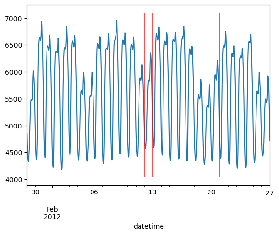
The above window is representative of all such windows in our entire dataset; no matter which window you see the occurrence of Holidays may not always coincide with the points in time where demand is highest or lowest for that particular window. You can also see that there are a few points higher or lower that occur outside of Holidays.
We can also look at a few statistical tests that allow us to compare the association between two categorical variables or the association of categorical variables with continuous variables. Without going into the maths behind the statistical measures used below, we will go with an intuitive understanding of the measures: The closer to 1 the higher the association. If it’s closer to -1 that indicates an inverse association.
Measure of Association with Holidays
Measure of Association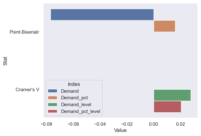
The above values don’t even go above 0.5. It’s safe to say holidays are definitely not associated. The city that never sleeps.
What are the Seasonal (daily, hourly, monthly, etc) patterns in the data?
We can understand patterns in data that change over time by grouping it into different categories such as days, weeks, or months. By doing this, we can create graphs that show us how the data changes over these time periods. We can also use a technique called STL to separate out different patterns, like trends and seasonal changes, from the data and create graphs to help us understand them better.
When we look at these patterns, we may notice that some occur at certain times of the day, week, or month, which is what we call “seasonal” or “cyclic” patterns.
The following Plots let us understand the electricity demand trends varying by hour and by month:
Hourly Trend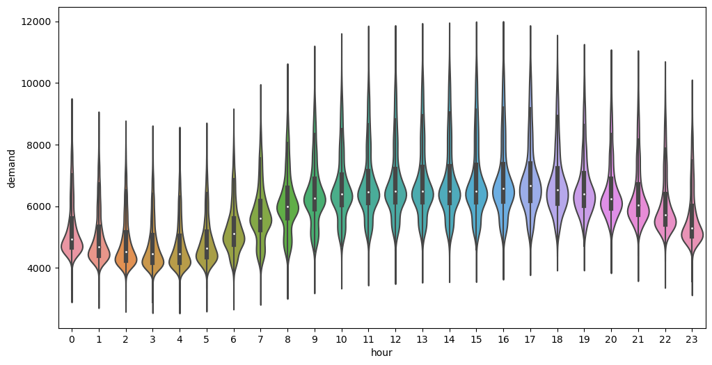
Each Day follows a certain pattern across different Hours grouped by month.
Hourly Trend across Days grouped by month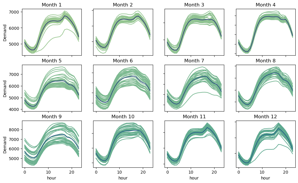
In the graphs below the time series has been broken down using STL into trend, seasonality and residual components. Trend shows overall increase or decrease, seasonality shows repeating patterns, and residuals are the leftover differences between the actual data and the trend and seasonality components. By analysing these components separately, we can identify patterns and trends in the data.
This is what extracting daily seasonality would look like:
Daily Seasonality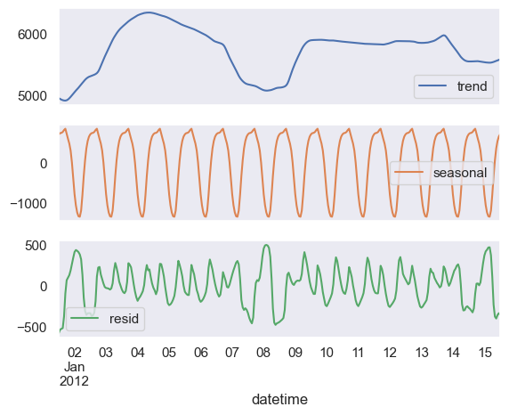
If we look at the weekly decomposition we see that some amount of daily seasonality has leaked into our weekly seasonality plot below.
Weekly Seasonality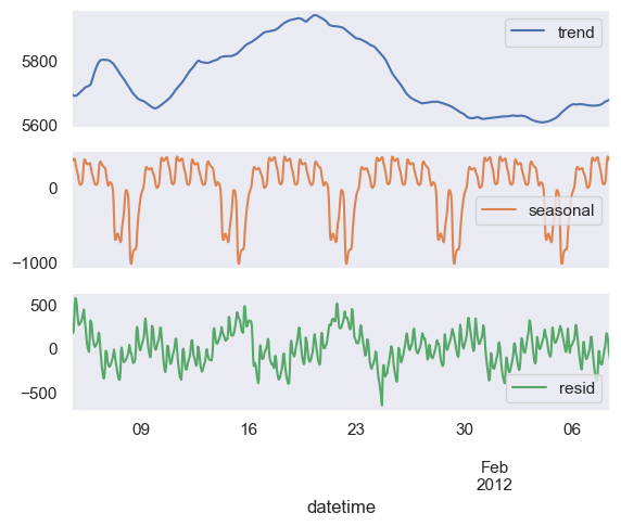
The plots above do however give us an understanding of the magnitude and pattern of seasonal components.
From looking at the data, we can see that there are patterns in electricity consumption that are related to the time of year and time of day. For example, during the winter and summer months, we see changes in electricity usage. Additionally, electricity usage is lower during the early morning hours and increases as people start their daily activities and businesses open up.
While current/historical demand patterns can affect future electricity demand to some extent, weather and other factors can affect daily variations. Studying the relationship between weather and electricity consumption can improve our forecasting models. But first, we need to visualise the relationship between our target variable and other factors in the model.
Note that we will be considering lags of values in cases where the value of such variables is not known in advance.
A good way to look at such relationships is a heatmap of the Pearson’s correlation statistic between demand and other variables.
Correlation Heatmap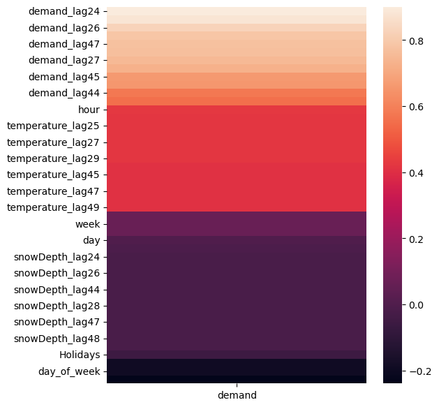
One very helpful tool is mutual info regression score that captures linear and non-linear relationships. I have plotted the score assigned to different variables with respect to demand below.
Mutual Info Regression Score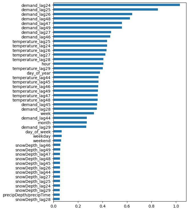
How viable are SARIMA & traditional ML algorithms to forecast electricity demand?
To create the best possible forecasts, a variety of techniques were used to carefully select and engineer features. Feature engineering is the process of selecting and transforming relevant variables to improve the performance of machine learning models. This included using trigonometric transformations to capture cyclic patterns in the date-time variables, as well as one-hot encoding to capture any period-related patterns. Additionally, lagged temperature variables were used to account for the fact that inclusion of weather data for the next day is not possible in absence of weather forecast data. The 24th through 29th lags of temperature were selected based on their high correlation and mutual information scores.
The machine learning model was carefully chosen. Overall, the combination of feature engineering and model selection led to the creation of an accurate and reliable forecasts of energy demand.
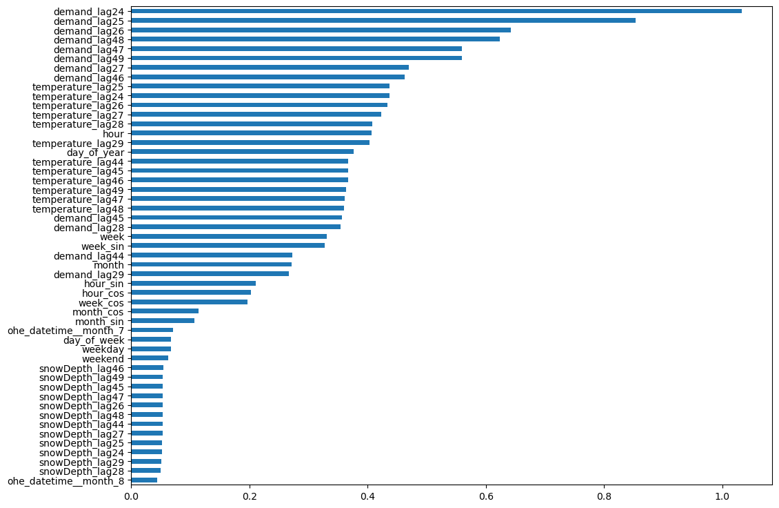
Mutual Info Regression Score
The data was divided into 3 parts for the purposes of training, validation, and test. This is a standard practice in model validation.
The SARIMA model performed well on the validation set with a MAPE (Mean Absolute Percentage Error) of 5.62 but not on the test set with a MAPE (Mean Absolute Percentage Error) of 7.24, indicating it may have overfit and that SARIMAX may be a better option since it can learn from exogenous features.
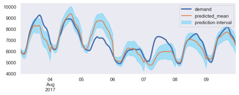
SARIMA Results
After experimenting with different machine learning algorithms, we found that LightGBM was the most accurate for our use case. Random Forest also performed well but LightGBM outperformed it in terms of both accuracy and speed. ElasticNet, being a linear model, was not as effective in capturing the non-linear relationship between the weather and energy demand.
An autoregressive multi-step forecasting strategy was used to backtest the models, and the LightGBM model achieved a Mean Absolute Percentage Error (MAPE) of 4.6 on the test set, which was slightly higher than the MAPE of 4.2 on the validation set.
Overall, LightGBM proved to be the most effective algorithm for forecasting energy demand in this specific use case.
How important are NYC Weather Variables as predictors to forecast electricity demand?
For the algorithms that were considered, an autoregressive multi-step direct forecasting strategy was used meaning a separate forecaster for each step was built during the backtesting. Below are the visualisations of the feature importances assigned by the models for each step.
Note that only the top 10 most important features have been plotted.
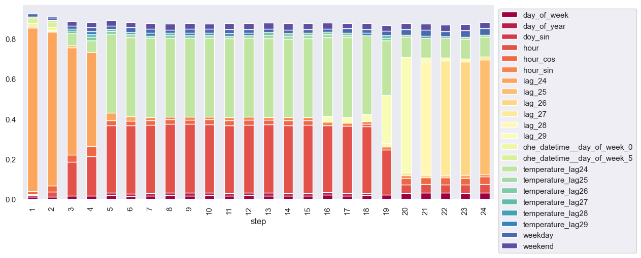
Feature Importance
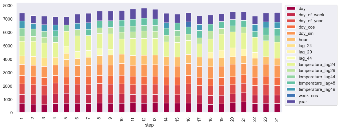
Feature Importance
Both of the above graphs indicate that temperature lags have been given significant importance in the model. Notably, the lags of temperature were found to be as significant as the lags of the target variable, and the day and hour features also appear to be important predictors.
If LightGBM model is implemented with prediction intervals, this is what our forecast looks like:
LightGBM Prediction Intervals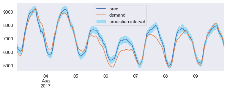
Here’s a look at the best forecaster’s result:
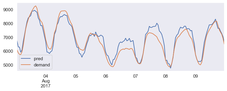
Best Forecaster
The Way Forward
To make more accurate predictions, a model called SARIMAX can be used that considers factors like weather and time of day. However, since these relationships can be complex & non-linear, it’s hard to get really good results with linear models alone.
Inclusion of more information about the weather, such as rainfall & humidity and the incorporation of weather forecasts would improve the forecast even further. For example, our model did not predict accurately on a rainy day (Aug 7th), so it’s important to consider weather when making predictions.
The forecast accuracy is approximately 95–96%, which can be further improved to around 98–99% by incorporating additional variables and conducting extensive feature engineering using ensemble models. There is potential for exploring different algorithms and identifying influential factors not yet included in the dataset. Nevertheless, the achieved level of accuracy is significant.