Time Series Analysis Part 1: Data Visualization

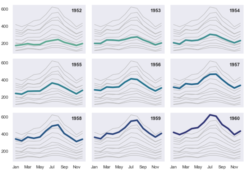
Multiple Time Series using Seaborn
Time Series Analysis Part I: Data Visualization
This is part of a series of posts that aims to capture and compile the knowledge required in order to analyse time series data. This part will take you through the basics of visualising the data.
For your specific case, you can start by creating a line plot of your target variable over time, and then create scatter plots to explore the relationship between your target and the other independent variables that you have included after taking into consideration the potential off various factors to influence your target variable. You can also use built-in functions of numpy, pandas to calculate correlation between variables.
Seaborn provides a great way to visualise your time series data by breaking it down into multiple time series, which can be found here. You will also need to group your time series by different temporal categories.
Here’s a snippet of how to do it:
import matplotlib.pyplot as plt
import seaborn as sns

# Creates a dictionary with months as keys and a particular position (ith row, jth col) in the grid plot as the value
nrow, ncol = 3, 4
count = 1
ar_coord = {}
for r in range(nrow):
    for c in range(ncol):
        ar_coord[count] = (r,c)
        count+=1

# Selects color palette
color = sns.color_palette("crest", n_colors=48)

fig, axes = plt.subplots(nrow, ncol, figsize=(12, 7))
for i in range(1, 13):
    ax_coord = ar_coord[i]
    # Creates a slice of data based on the grouping you want, then pivots the data by segregation you want
    pivot_df = pd.pivot_table(df[df.month==i], index='hour', columns='day', values='target', margins=True, margins_name='mean')
    pivot_df.drop('mean', inplace=True)
    pivot_df.drop('mean', axis=1).plot(title=f'Month {i}', legend=False, ax=axes[ax_coord[0],ax_coord[1]], sharex=True, sharey=True, color=color[i])
    pivot_df[['mean']].plot(legend=False, ax=axes[ax_coord[0],ax_coord[1]], sharex=True, sharey=True, color=color[-i])
plt.setp(axes[:, 0], ylabel='target')
plt.show()
The above code will help you work with different groupings of your time series data. Also, of note is that for higher granularity or temporal resolutions the above code will perfor better than seaborn’s example code provided in the link above.
Additionally, you can also look into decomposition techniques such as STL (Seasonal-Trend decomposition using Loess) or ETS (Error-Trend-Seasonality) to break down the time series into its components like trend, seasonality and residuals. You can use the statsmodel library for this. However that is beyond the scope of this part and we will be delving deeper into statistical analysis for time series in a later part.
A quick way to realise any overt relationships that are there between your (features) independent variables and your target (dependent variable) is to look at the correlation plot. The .corr() method of pandas for dataframes paired with seaborn’s heatmap can help you visualise the aforementioned relationships.
sns.heatmap(df.corr())
You can also have a look at the non-parametric technique called mutual info regression using Scikit-learn’s mutual_info_regression() that can be used to calculate mutual information between a continuous target variable and multiple continuous or categorical predictors. Note that this technique doesn’t make any assumptions about the underlying probability distribution of the data and can thus be used to identify non-linear relationships between variables.
Considering the fact that the three sections above both need a fair amount of statistics knowledge, they can’t simply be categorised as visualisation techniques. We will cover the theory of these techniques and most importantly usage examples in the subsequent parts of this series.